
Machine Care
How to simplify a complicated cleaning process for Cricut Venture users.
My Role: I was the lead UX designer on this project and contributed everything from initial designs and concept ideations to final deliverables and creative direction on video assets.
This project took 6 months non-linearly between hardware QA, UX software design + testing, and creative development for assets.
Problem:
The mechanics and capabilities of Cricut Venture require more frequent machine cleaning and maintenance for optimal performance. This is due to a few factors:
Increased cutting speed
Frequent use (Professional & high production users)
Environmental factors
I had to find a way to help users easily take care of their expensive machine.
Manual & Mechanical
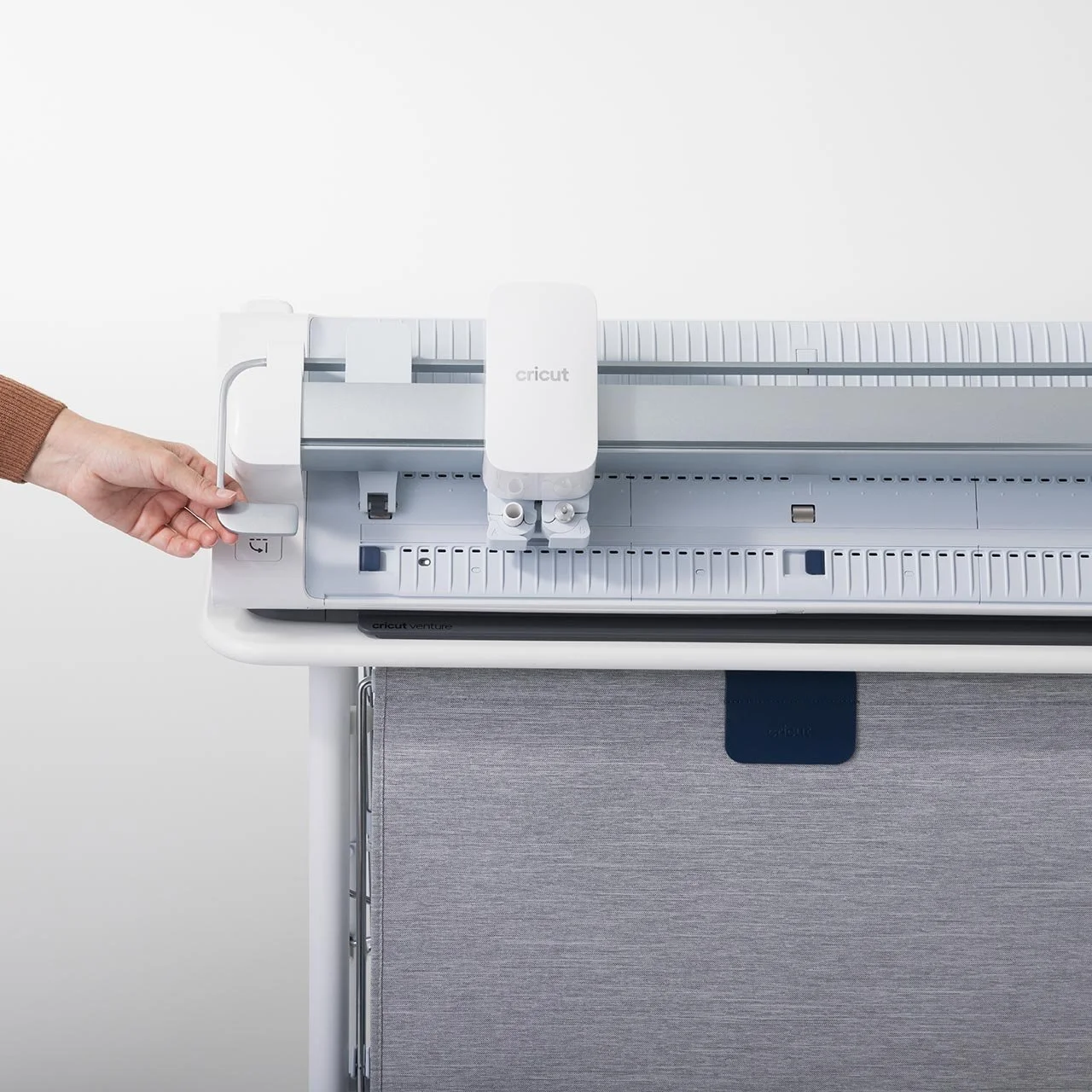
Cricut Venture is the first cutting machine in the portfolio that requires users to manually interact with various parts of the machine for each use. This is due to the dynamic and adjustable nature of the machine cutting different widths and formats.
2. Fast cuts = fast debris buildup.
With Venture being a professional series machine, it cuts really fast.
Some of the parts that make this possible are called pinch and floor rollers respectively, which quickly move materials and mat up and down on a Y access. That movement can cause remnant debris from the material to build up in the rollers over time.
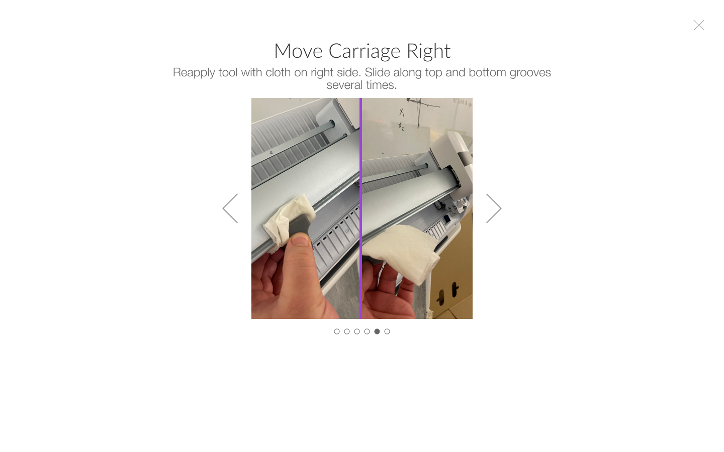
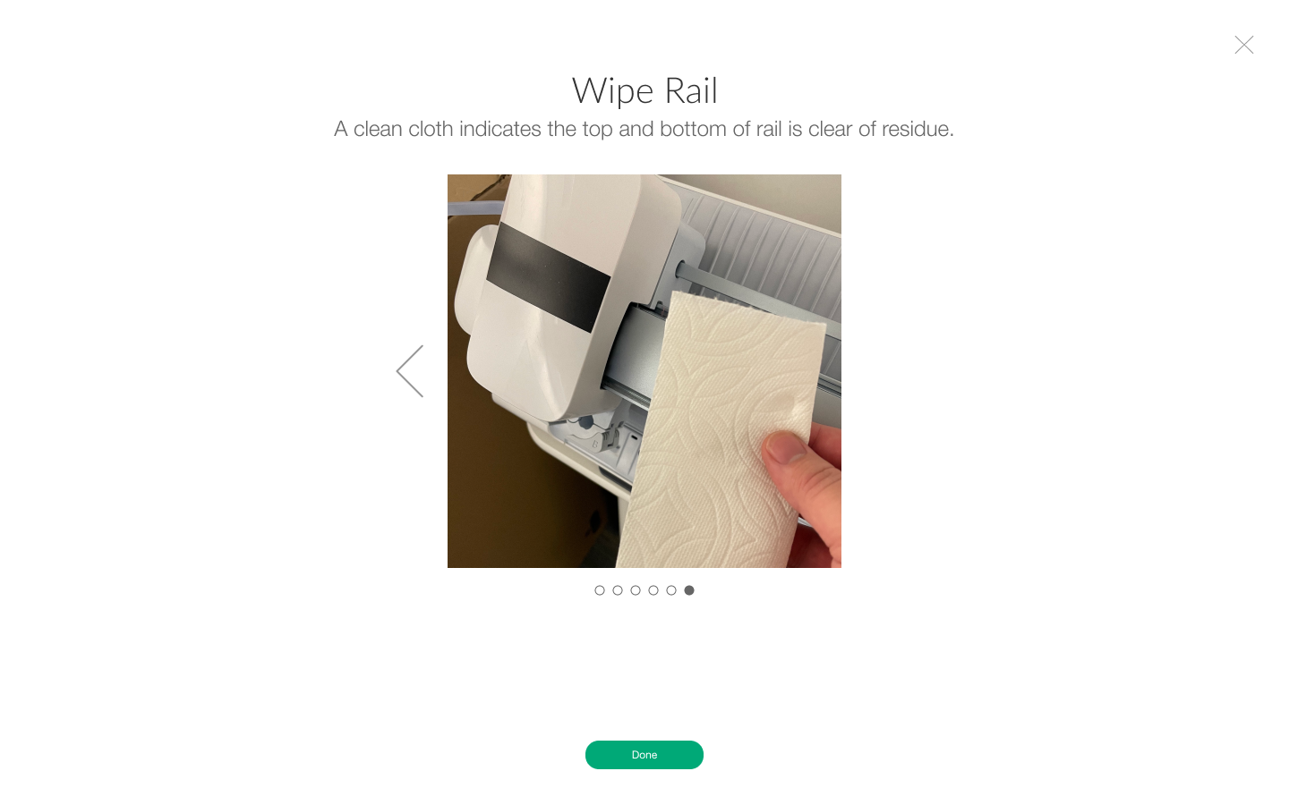
Additionally, the tool housing moves on the rail left and right just as fast on the X axis, causing debris buildup on the rail and track grooves. This can be due to environmental factors, frequency of use, and mechanical wear over time.
3. Hypothesis & Design
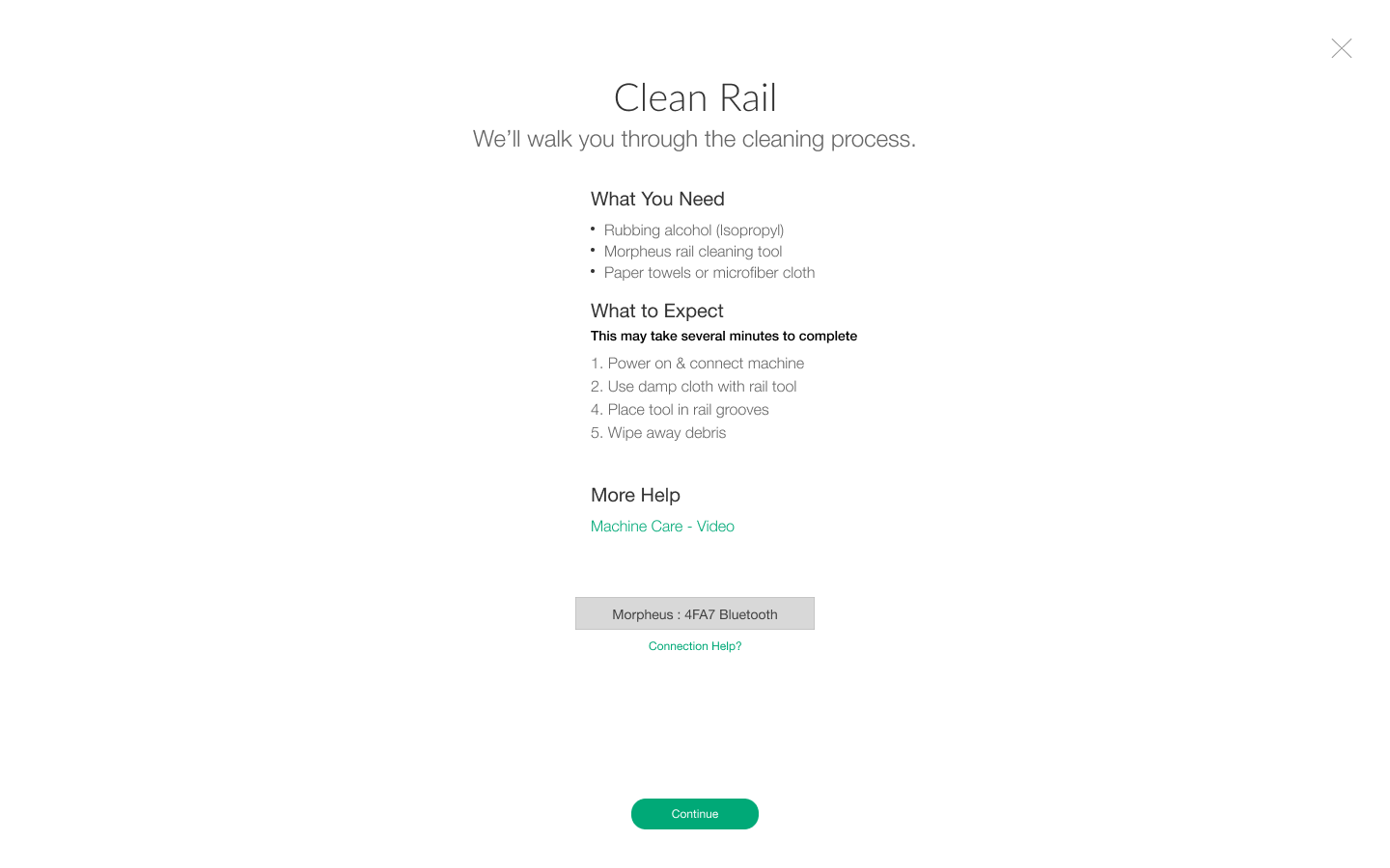
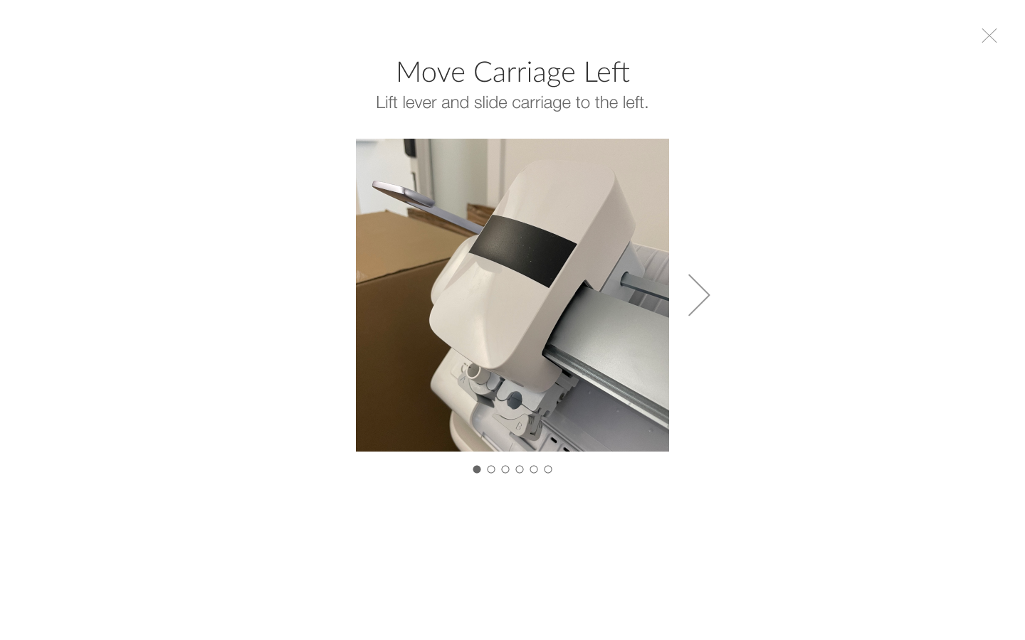
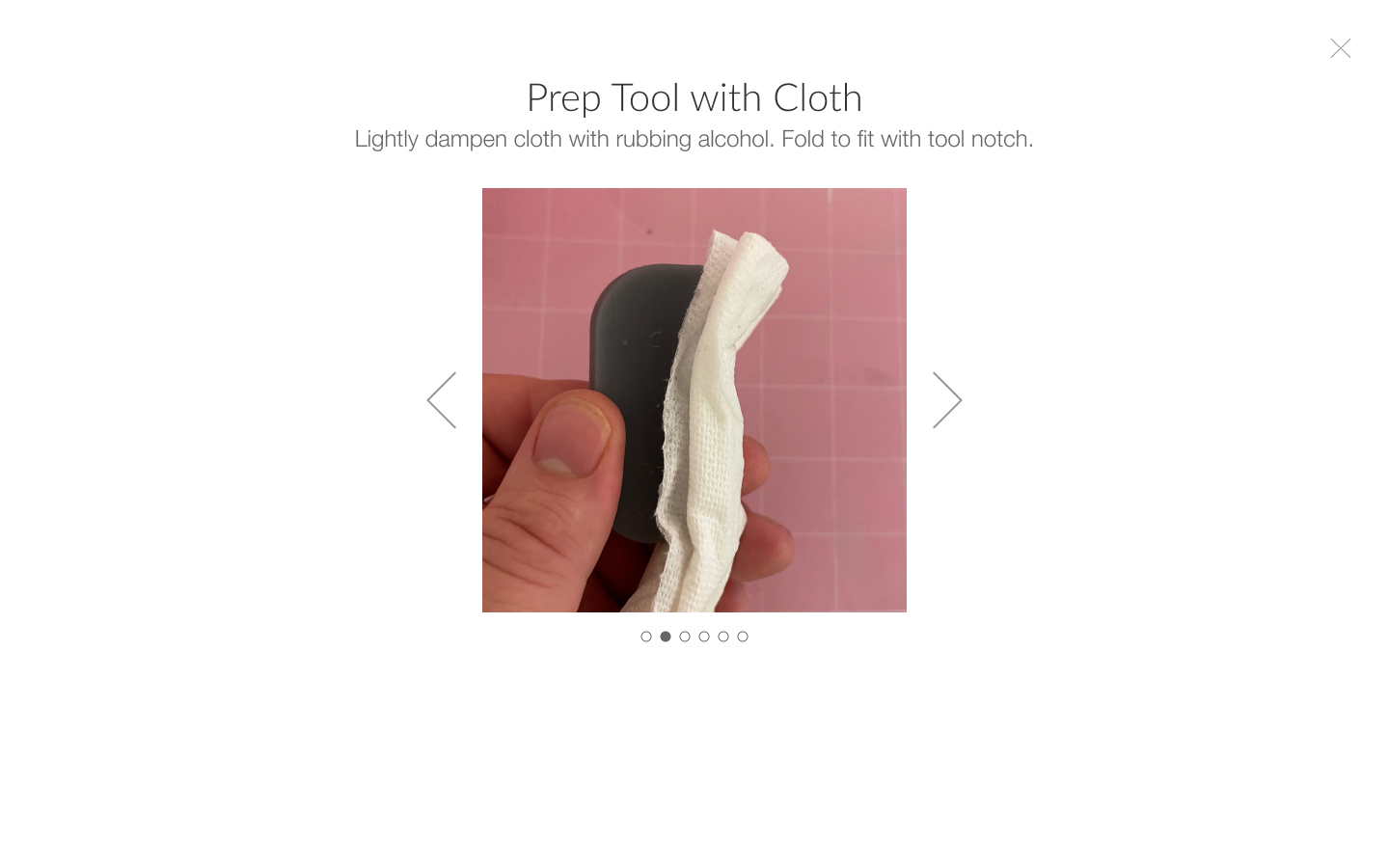
The work I had done on Hi-Fi Visualization communicating easy product setup steps to users had proven massively effective, so it felt like a natural extension to bring that methodology into this design discovery.
I started off replicating the Out of Box designs + images taken with my iPhone mimicking the steps users would need to take, aided with helper copy, and began testing prototypes. (The scrolling gallery below is the format of the Out of Box designs).
These are the screens of the first prototype:
4. Cross-functional collab
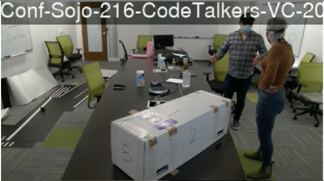
For the user testing, I worked with ID and HW Eng to think about what a cleaning kit might look like. We wanted to include it with the machine.
We agreed on a firm poly bristle brush, a cloth (we tested wet wipes, hand towel, microfiber cloth, and paper towel), and q-tips.
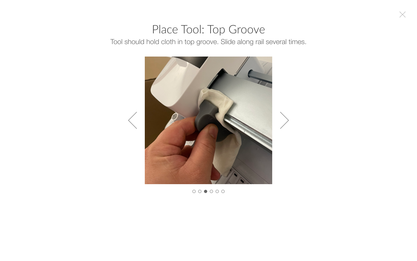
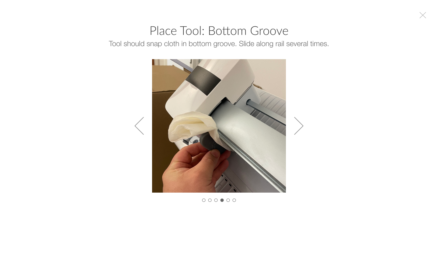
The rail has two grooves top and bottom, which the carriage housing wheels are set in. I felt it was unreasonable to expect users to be able to effectively clean in the grooves with just q-tips, and asked if ID would come up with some variations on a C-clamp type clip, with enough tension to fit a cloth in the grooves to effectively clean.
ID agreed and came up with some 3D printed prototypes which I also included in the testing.
Testing & Findings
I wrote the test criteria and questions, conducted recruiting and gathered a great group of users who were Cricut aware, but new to the concept of manually interacting with a machine.
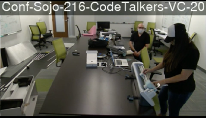
The test participants were 50/50 both seasoned Cricut users, and people who had no experience using Cricut products.
Successful Test!
The software prototype was largely understood, and resulted in successful user completion of each flow. Save for minor copy tweaks, UI refinement, and final creative assets, I was able quickly move on to the next development phase.
The top contour of the test was to validate if users understood the instructions (copy + imagery) for each step of the cleaning flow. We wanted to make sure the process was clear and repeatable by each user of any skill level.
Scaling Design for Other Uses
Could this design serve other purposes? As I was working on this machine care problem, there were other initiatives moving in parallel throughout the org. I knew we had extra time for deliverables, and took it upon myself to ask the question:
“What if I created a design that leverages this high visualization architecture, but scales to work for all utility, calibration, setup and other flows?”
This would simplify future needs, and reduce tech debt for feature support and products not yet developed. I began my design exploration.
I did an audit of all utility type flows that existed in Design Space and used that as a baseline to figure out where requirements coalesce and where there are differences.
Then I worked through variations of how we might execute this, different modal types and layout configurations.
Ultimately we landed on a full screen, reconfiguration of my initial Out of Box design, with a left-right format.
This design and spec with breakpoints also allowed me to push dev for responsive layout scaling, which had long been absent from our software experiences.
Recommendations & Deliverables
Repurpose the step-by-step design framework
Design I authored for out of box setup
Refine copy based on UX intent and user feedback
Define creative assets (videos)
Wrote shot list, creative directed each video
Define timers and triggers in software to prompt user to clean
This screen recording was done in a dev environment - so you won’t see the second flow I designed, and Step 4 has software buttons to control the machine that are for demo purposes, and aren’t live in production.
Impact
“Aside from providing contextual help, this feature has greatly reduced users calling into our customer care center, alleviating on phone support and promoting user autonomy.”